When doing market research and analysis, you often need some convincing data charts to prove the feasibility of your own market development strategy, so as to determine the main target market for subsequent development. In the UN Comtrade Database, there are some practical data for us to use.
Visualize data is visual data. It uses some tools to present UN data in the form of a new visualization, and changes the previous rigid form. What exactly is it like? Let’s have a look.
First, in the drop-down list of Visualize data, find this tool: An atlas of economic complexity.
After entering the page, find the Explore (search) section, this section can be established by the country / region data visualization charts to show the import and export product structure of each country, as well as global trade trends and flows, and recently found new Economic growth opportunities. Let's take a brief look at the functions.
In the function options on the right, you can drop down to select or directly enter the country to determine which country's trade data you want to search. You can also directly search for products to display information such as product categories, import and export details, and trade shares of different countries. The following are the two functions of trade visualization and complexity visualization that will be used next. Another thing to add is that according to the horizontal axis of time below the visualization can choose the corresponding annual range and span.
Trade visualization
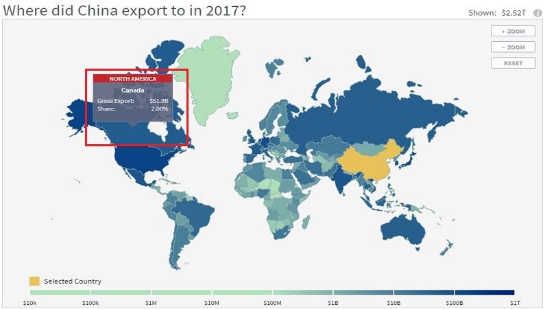
Taking China's 2017 export products as an example, if the country option is China, you can see a tree diagram listing each type of export product in the form of a grid, including product description, HS code, and share information. As shown below:
Taking China's 2017 export products as an example, if the country option is China, you can see a tree diagram listing each type of export product in the form of a grid, including product description, HS code, and share information. As shown below:
There is also a stacking chart that changes with time. You can see that the horizontal span of the horizontal axis is from 1995 to 2017. It has a certain time range, and you can see the changes in product exports over the past few years. We found that in recent years, China's exports accounted for a large proportion of electromechanical products (mechanical and electronic products), and chemical products, metal products, textiles and so on.
Similarly, if you want to check which types of products China mainly imports, you can choose to import directly in the direction of trade flow.
Comparing the two figures, it is found that the product structure of imports and exports is similar. It can be seen that in terms of mineral resources, China's import volume is very large. You can also choose different years to observe the changes in the product curve, whether it is in an upward or downward trend.
Let's try to enter specific products to see, for example, enter the HS code 940540 of LED products.
Through the above screenshot, you can see that China mainly exports electric lights, accessories and other products to the United States, Germany, the United Kingdom and other countries.
Next, let’s have a look on imports.
Obviously, in recent years, China has mainly imported electric lights, accessories and other products from Germany, Japan, South Korea, the United States and other countries.
The visualization here can see the trade flow of the 6-digit coded products, including the flow of export products and incoming and outgoing goods, and which countries and regions are mainly flowed to, which can give us a certain reference value.
Visualization of complexity
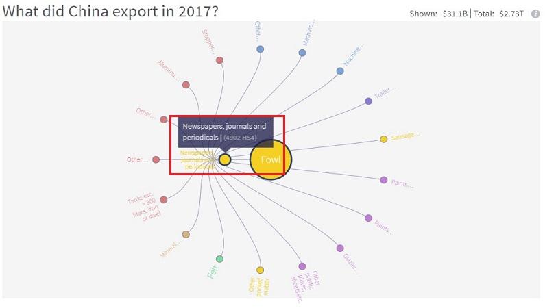
The complexity visualization includes three presentation methods: product space, feasible opportunity, and ring diagram. Similarly, taking China's exports in 2017 as an example, let's look at the three charts separately.
The product space map shows which products were exported by China in 2017 and the similar product connections. For example, as you can see in the picture, China's electronic integrated circuits accounted for a relatively large share of exports of petroleum products and automobiles in 2017. The larger the product export volume is, the larger the circle in the figure is.
The feasible opportunity chart shows which products are feasible in China in 2017, that is, a country can realize the opportunity of diversifying its product market according to the current export situation. It can be seen that oil, cars, auto parts, gold and other products have large circles, and the export volume is relatively large.
The ring chart shows what China exported in 2017, that is, what are the exports of the selected products, or related products, usually include those products exported by the same country. The picture shows that China's exports in 2017 including metal products, minerals, mechanical and electrical products, plastic products and so on.
The size of the nodes of the three charts depends on world trade. In general, the visual chart of economic complexity mainly shows that if a country is more capable of constructing a complicated product space, it means that the country's economy is more prosperous.
Many of the visual data charts included here can provide us with real and convincing data and chart support when doing market research and analysis to determine the main target market and a series of subsequent development work.

In the process of using Google to search for customers, freq...
2020-08-17|2039 views
Generally, we find the contact information of customers thro...
2020-03-30|1940 views
When we make ocean calls to foreign trade customers, we may ...
2020-08-21|1467 views
When we use Google to search for product keywords, we often ...
2020-08-13|755 views
Using this combined query method can help us filter out some...
2020-03-30|750 views
The action of sending a foreign trade development letter is ...
2020-04-03|608 viewsWhatsapp:+8616621075894(9:00 Am-18:00 Pm (SGT))
About us Contact us Advertise Buyer Supplier Company report Industry report
©2010-2024 52wmb.com all rights reserved
 Traders


